
Wednesday, December 8, 2010
Monday, November 29, 2010

Sunday, November 21, 2010

Sunday, November 14, 2010


Monday, October 25, 2010
Finished Posters


Posters with Comments
 Victor: Too many questions. Change the second question to a statement.
Kla'ra: Make the font the same size. I like the crazy eyes.
My Response: I feel that these are all good suggestions.
 Victor: This poster also seems to show a good reason to study. It could go either way.
Kla'ra: Take off two of the exclamation marks.
My Response: I agree about the exclamation marks being removed. This poster is supposed to make the viewer want to enjoy the outdoors instead of studying.
Wednesday, October 6, 2010


Wednesday, September 22, 2010
My Original WPA Poster & the Mood It Creates
 The artist might have used this plain blank setting so that the birds and what they were doing would be focused on more than people admiring the setting that they were in. Also, the artist may have decided to use the plain background so that this birds could be pictured in any setting since I don't believe that a pelican and a toucan would be in the same habitat. The figure/ground relationship is that they are both very simple. The figures are treating the words in the background as if they are really there and not just words on the page for us to get information about the candid photos. The relationship between the two figures are interactive. They notice each other and are both interacting with the title. I feel that the artist is trying to really get the viewer to pay attention to the title with this composition and that the candid photos in the book are fun and playful. I don't feel that there is any really "special" lighting that is being used in his poster. I believe that the artist is just keeping everything very simple. I feel that I can evoke similarly without any text is by also keeping everything very simple and the feeling light. I could change the mood of the poster without any text and still stay true to the original artwork by still keeping everything simple but just have the figures in my poster more serious instead of playful.
Sunday, September 12, 2010
Advertising Techniques
 BANDWAGON: this type of advertising propaganda plays on people's desire to be on the winning side and join the crowd. In the poster on the left, people are urged to be like the majority that were winning the fight against syphilis because they did not wait too long to be cured.
 PATIOTISM: this advertising propaganda technique suggests that by purchasing something or by doing what they want you to do you are showing your love for your country. In this poster, they are suggesting that you can show your love for your country by supporting the soldiers with victory loans.
 WIT & HUMOR: this advertising propaganda technique tries to attract people through distracting them by making them laugh or entertaining them with clever visuals or copy. In this advertisement, they are using humor to get you to buy some Slim-Fast so that you're not too heavy like the bride figurine that was so heavy that she fell into the hole that she made in the cake.
Wednesday, September 8, 2010


Tuesday, August 31, 2010
Heroic Icons
 The image in the poster on the left really portrays what the copy says. The soldier not only has patriotism, but holds firmly onto it in his hands. I feel that this poster works well for stirring up the emotions of the American people during times of war.
I really am glad that I had the opportunity to read "Heroic Icons". I never thought about the importance of an artist and designer on shaping the opinions of large groups of people or stirring their emotions to support what a government wants them to do. Kind of makes me feel that art, no matter what kind, can be important and not just "fluff". Kind of makes me feel that I could possibly do something that would be important and not just "fluff".

The first poster to pop into my head after reading the article was "Rosie the Riveter". It was one of the few war posters that I've seen and have even seen a time or two in movies that took place during WW II. " A few months after Rockwell’s image, the most famous image of Rosie appeared in the government-commissioned poster “We Can Do It” (Yellin 44)."

I never realized that there were any other Rosie the Riveter posters other than "We Can Do It" until I was looking for a picture of it. "Norman Rockwell’s image on the cover of the Saturday Evening Post on May 29, 1943 was the first widely publicized pictorial representation of the new “Rosie the Riveter”. "
I feel that Norman Rockwell's version looks a little more like the "everyday woman" than Yellin's version.

In the "Heroic Icons", Superman and other comic super heroes were "tapped into the universal desire for invincible heroes to uphold, in this case, "Truth, Justice, and the American Way." Thinking about Rosie the Riveter made me think of Wonder Woman. I thought that maybe Wonder Woman was modeled after Rosie the Riveter, but then I found out that Wonder Woman "first appeared in All Star Comics #8, which was published by All American Publications in December of 1941. " I find it kind of interesting that they were created around the same time.
Tuesday, August 24, 2010
Posters From the WPA
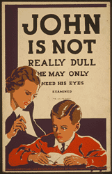
The artist is trying to influence behavior by example. The artist is showing mothers that they show check to see if their child has a problem with their sight. I like how the artist made their message appear as an eye chart. Putting the boy in a red sweater draws my attention to the child and then the child's eyes draw my attention to the mother holding the paper for him to read. The poster is convincing me to have my child's eyes examined by showing me a mother who is concerned enough about her child to see if he can read the paper she is showing him and if I'm concerned enough about my own child I should do the same.

This palette has warm tones. The variations in brown values allows for shading. The red attracts attention.


The artist's style is simplistic with some minor shading. The people in the poster have been simplified, but are still not too abstracted so they still have realistic qualities.

The poster makes me want to go to the zoo to see the different types of animals. The poster is asking me to visit the zoo. The poster is convincing me to want to go to the zoo by showing me an interesting looking animal in pretty realistic detail making me interested and curious about all the other interesting animals that are at the zoo for me to see.

The yellow is somewhat bright and attention getting. The variations in value of the browns allow for pretty good shading allowing for giving three-dimensional shape to objects.

The artist's style is pretty realistic giving great attention to detail. Although the subject in the poster is not photo real, the artist makes it looks pretty realistic do to the detail in the shading. The yellow used in the background really makes the subject "pop".

The artist is using a couple of different birds doing playful things to capture the interest of the viewer to buy the book and check out the 100 pictures of different birds of the world and see what fun and amusing things that they are doing in the photographs. The poster wants me to buy the book of 100 pictures of birds from around the world. The poster is convincing me to buy the book of 100 photos by showing a couple of playful birds.

This palette is fairly bright with only one dark color. There is a combination of both cool and warm colors. There are not a lot of variations in value of one color, but there is one big contrast in light and dark between the white and the black. I like the contrast between the warm golden yellow and the cool crisp blue.
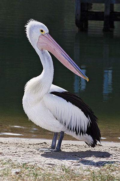

The artist's style is very simplistic with no shading. Even though the animals are very simplistic, they still look realistic. The artist's style is also playful with the pelican trying to eat the "E" and the toucan perched on the "D".
Subscribe to:
Posts (Atom)