
Scott Campbell's
Hold and Release (below) on it's own when framed, to me, feels like more of a piece of art than when used in his
Why? poster. When this same piece of graphic art is used in the poster, to me, feels like it is serving the purpose of promoting something instead of just "being"...being a piece of art.

I'm aware that part of the purpose for this exhibit is to make people aware and to see that graphic design is art. Also, some people have trouble seeing it as art if it is serving a purpose because a graphic designer is creating it for his/her job and not just for the sake of creating art for art's sake. I feel that even though a designer has created a piece for a job, it is still art and that they created it with the same abilities and creativeness that they would have used if they were just creating the same thing for art's sake. Where
Hold and Release "feel" more like a work of art because it lacks the promotional copy, the same amount, in fact the exact same creativeness was use in the promotional poster
Why?.
 Scott Campbell's Hold and Release (below) on it's own when framed, to me, feels like more of a piece of art than when used in his Why? poster. When this same piece of graphic art is used in the poster, to me, feels like it is serving the purpose of promoting something instead of just "being"...being a piece of art.
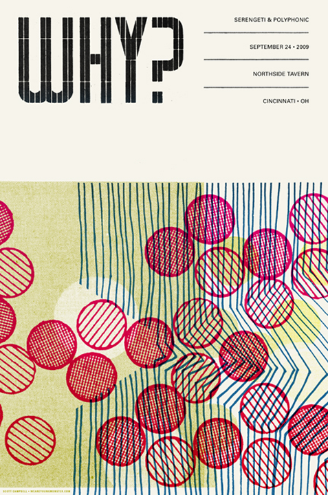
 I'm aware that part of the purpose for this exhibit is to make people aware and to see that graphic design is art. Also, some people have trouble seeing it as art if it is serving a purpose because a graphic designer is creating it for his/her job and not just for the sake of creating art for art's sake. I feel that even though a designer has created a piece for a job, it is still art and that they created it with the same abilities and creativeness that they would have used if they were just creating the same thing for art's sake. Where Hold and Release "feel" more like a work of art because it lacks the promotional copy, the same amount, in fact the exact same creativeness was use in the promotional poster Why?.


