
Monday, May 2, 2011

Wednesday, April 20, 2011

Monday, April 18, 2011

Sunday, April 10, 2011

Monday, April 4, 2011

Sunday, March 27, 2011
Why? Hold and Release Scott Campbell
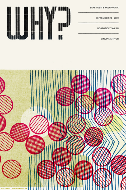 Scott Campbell's Hold and Release (below) on it's own when framed, to me, feels like more of a piece of art than when used in his Why? poster. When this same piece of graphic art is used in the poster, to me, feels like it is serving the purpose of promoting something instead of just "being"...being a piece of art.
 I'm aware that part of the purpose for this exhibit is to make people aware and to see that graphic design is art. Also, some people have trouble seeing it as art if it is serving a purpose because a graphic designer is creating it for his/her job and not just for the sake of creating art for art's sake. I feel that even though a designer has created a piece for a job, it is still art and that they created it with the same abilities and creativeness that they would have used if they were just creating the same thing for art's sake. Where Hold and Release "feel" more like a work of art because it lacks the promotional copy, the same amount, in fact the exact same creativeness was use in the promotional poster Why?.
Hidey Ho Albert Exergian!
 It was very difficult to pick one of Albert Exergian's poster that I would want to talk about. I found the posters, that I actually knew at least a bit about the TV shows that he was representing, very clever. Even though they were very minimal, they spoke volumes. I did not find a bunch of information about him. On the guardian.co.uk website, I found out that he is Austrian and they referred to this series as "a series of modernist images inspired by TV shows that echo recent online reinterpretations of Saul Bass and Pelican Books." On thing that I liked about his Home Improvement poster is that even though the main thing that the show was centered around, Tim Allen's character having a home improvement show and how he would usually mess up a project instead of fix it, he used an iconic prop from the show the was used at the end of every show. Most of the time Tim, but sometimes his wife, would discuss whatever problem that they were having in that episode with their neighbor who, no matter what, you would never see any part of him except for the top part of his head above that white privacy fence.
Wednesday, March 23, 2011

Inspiring Infographics
 When creating my info-graphic of showing how to say "I love you" without saying a word, I am thinking of showing the amount that it would mean to someone by using some shape, maybe geometric, and having some color change. I could actually show the difference and degrees by either creating something similar to either this first info-graphic or the second one. I could either have a mother and father in the bottom center where the earth is above or have a large heart in the torso of each body and have different examples inside. Of course, the bodies would have to be a bit bigger.
 With this third one, I like the way the difference in amounts are represented by size. I can't decide whether or not to show degrees of difference by the darkness of a certain color or by the size of the object used to represent "love", probably a heart.
All three of these info-graphics have been useful in a way to the development of my own info-graphic. Before finding these, I wasn't really sure how to go about showing the information without putting it into a boring graph. Now, the hard part is going to be to decide how I'm going to blend these ideas to make an interesting info-graphic of my own
Wednesday, March 9, 2011
Infographic
 First, I plan on making a list of everything that I feel that a spouse and children can do to show their spouse or mother that they love them without saying a word. Second, I plan on seeing if I can find other people's opinions on this subject on the Internet. I want to display the results in a visually interesting way, but I haven't totally figured that part out yet. I'm still pondering.
*** Going to change to "How to Say 'I Love You' Without Saying a Word" so that it won't be gender specific.
Monday, March 7, 2011

Monday, February 28, 2011


Wednesday, February 23, 2011

Monday, January 31, 2011
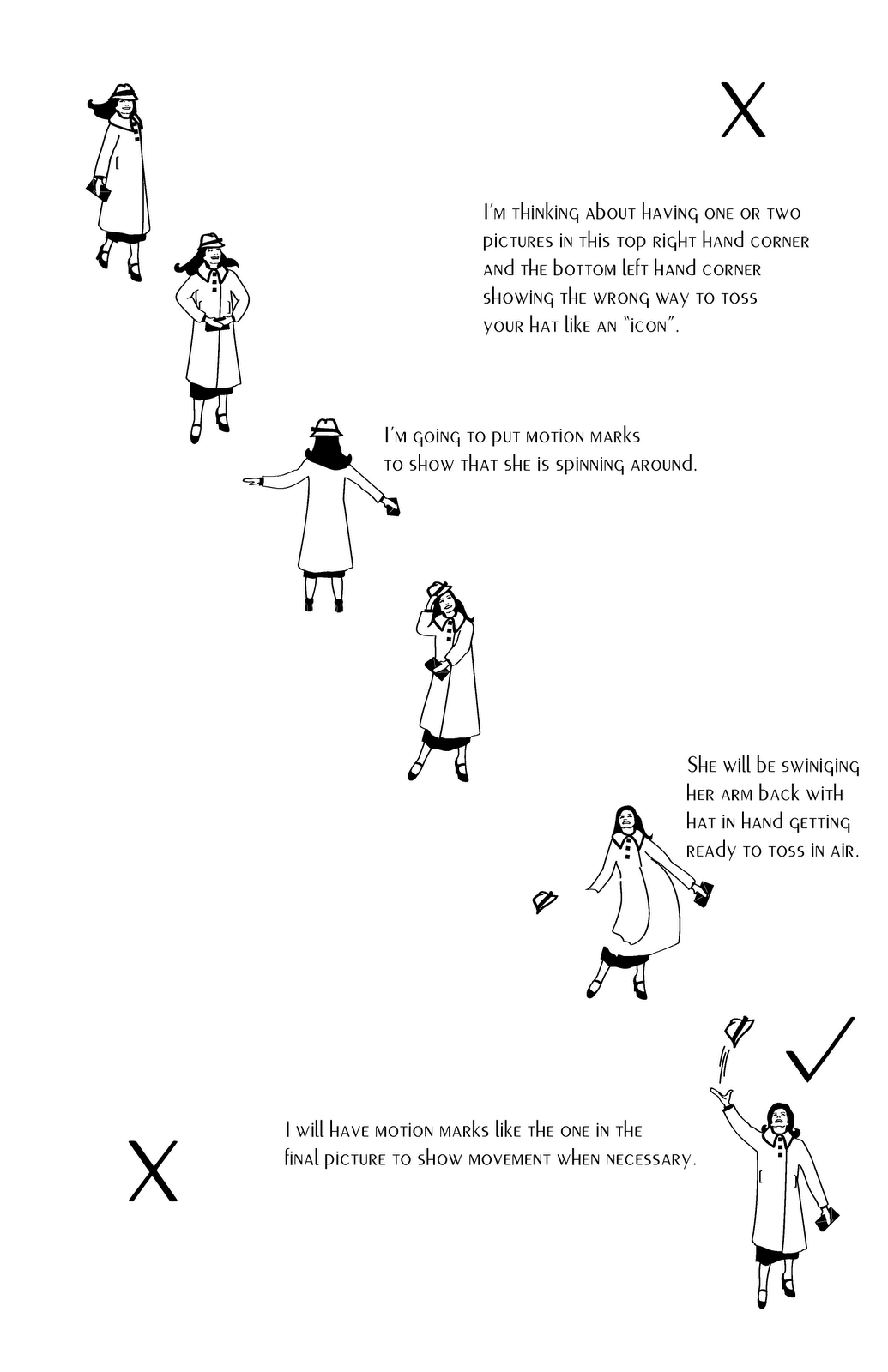
How to Toss Your Hat Like an Icon

Kla'Ra's comment before posted this final poster: I really like the idea. I also think that you did a good job creating the icons. Adding the motion signs is going to help understand what is she really trying to do. What I don't understand is the layout. Is there going to be only two pictures showing the way how is wrong to throw the hat? You probably have in mind the composition already but right now it's not clear for me. Looks really good though. It is totally different from all the other projects everybody else has. Good job!
Wednesday, January 19, 2011
Symbols: The Alphabet of Human Thought

After reading this article, I found that there were many types of symbols that are used as alphabets of human thought. I decided to focus on ideograms. Ideograms are characters or symbols that represent a complete idea or concept according to the article. I feel that using ideograms is a very good and efficient way to get your message across to a large amount of viewers.
 I thought that this one for a bicycle path was cute and very visible on the dark gray road.
 I found this ideogram amusing even though it probably was not meant to be. My first reaction was that I was not sure if I would want to stop swimming if an alligator was coming after me with his jaws open wide. Also, because of the way these two ideograms are juxtaposed, it made me think that they were predicting the outcome of the swimmer. In a way, they may have been predicting the outcome of a swimmer if they decided to swim where hungry alligators were present!
Gerd Arntz- Isotypes
I found some isotypes that I liked because, to me, they look like they have a lot of detail without really having a lot of detail.

I like the way that just a few placed bubbles gives the feeling of a bunch of foaming soap. Also, I like how just three vertical lines give the feeling of water flowing from a faucet.

I like the detail of the stacks of paper on the table, the man's tie and the pencils in their hands.
 I like the detail of the "travel" isotype by Arntz. The man's clothing has a lot of detail in a simplistic way along with the chair that he is sitting on. I like the feeling of moving forward that is accomplished by putting the man in the chair on an arrow.
The Peace Symbol

At the end of the article, it mentions that signs and symbols can be either considered or interpreted as meaning something good or bad depending on how they used over time and who is interpreting them or using them. The peace symbol uses a basic fork-like symbol or "gesture of despair" motif that is associated throughout ancient history with the "death of man", and the circle with the "unborn child". The fork-like symbol was given the name the "gesture of despair" because, Peter, one of Jesus' twelve apostles, was crucified by Emperor Nero on an upside-down cross in A.D. 67 in Rome. During the 1930's, the peace symbol was first created by the English philosopher and socialist Bertrand Russell as an attempt "to depict the universal convergence of peoples in an upward movement of cooperation." Many people that wear the symbol today as a part of fashion, probably have no idea of its meaning in the world's past history.
I found some interesting peace signs that I thought were very creative.

Green Peace


B-52 Peace Sign
The Swastika
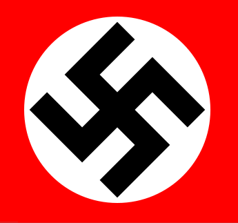
In the reading about the swastika, it mentions about how this symbol was used over and over again in ancient times and is still used in rituals in some Eastern and Far Eastern cultures even today. Before Hitler used and tweaked this symbol, it meant "well being", "good fortune", and "luck". Hitler's version was turned on a corner in a diamond orientation rather than the previously used square orientation. Even though when the swastika is not turned on a corner it is not supposed to represent the Nazi party, it is hard for me to get past what it stood for and see it as representing something good.
The article also mentions about how "Hitler's identity system is the most ingeniously consistent graphic program ever devised. That he succeeded in transmuting an ancient symbol with such a long-lasting historical significance into one that was even more indelible is attributable to his mastery of the design and propaganda processes."
The following pictures are ones that I found showing the swastika being used in the past:
 The Swastika Stone- located on the moors near Ilkley in West Yorkshire, England
 Netherurd's Swastika Cross Stone- found in Netherurd Main, Kirkurd, Peebleshire, it is thought to be a 10 - 12 century carving on the remains of an old Christian cross. I highlighted the swastikas in red.


Wednesday, January 12, 2011
Modern Hierogyphics
 I enjoyed reading "Modern Hieroglyphs". I had never thought about the visual signs that we see everyday as hieroglyphs, but I see now that they are. I can see how some of the signs would be difficult to understand if you were from a different culture, but some, like the ones for different types of sports, I would think anyone from any culture would be able to understand them. The only reason that they didn't understand them would be if they never watched or played that particular sport. I also found it interesting that the main time that the female figure is used is when it is on a bathroom door. I think that the use of modern hieroglyphs is a much more efficient and universal way of getting a message or an instruction across to the viewer. Especially, if the same hieroglyphs were used worldwide, than when someone was in another country and didn't know the language well, they would still be able to understand the visuals.
 I found this picture of the male and female hieroglyph dancing from nopartnerrequired.net. It's a website that wants to get you out on the dance floor. I thought that it was a cute idea to use those recognizable images in a different way.
 I found this picture, also when looking for a picture for the reading. I have never seen a male and female bathroom sign that was in this style before and thought that it was interesting.
 I chose this picture because I thought that it was pretty witty. Especially, since the creator of the original male and female hieroglyphs in the 1920s was the Viennese philosopher and social scientist Otto Neurath.
Subscribe to:
Posts (Atom)