
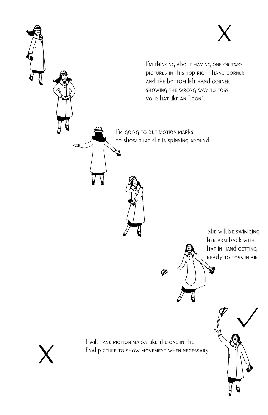
Kla'Ra's comment before posted this final poster: I really like the idea. I also think that you did a good job creating the icons. Adding the motion signs is going to help understand what is she really trying to do. What I don't understand is the layout. Is there going to be only two pictures showing the way how is wrong to throw the hat? You probably have in mind the composition already but right now it's not clear for me. Looks really good though. It is totally different from all the other projects everybody else has. Good job!
No comments:
Post a Comment